WEBSITE TIPS
What to Put on Your Music Website Homepage

Nida

Aug 11, 2026

Your homepage gets a few seconds to do its job. Someone hears your name, searches it, clicks through, and decides almost immediately whether to keep going or close the tab. Everything else on your site depends on that moment.
This post is for musicians, bands, and DJs who have a website and want the front page to earn its place. It covers what belongs on the first screen, the order everything below it should follow, which sections are worth having, what to cut, and how the whole thing should behave on a phone.
TL;DR
-
Your homepage needs one clear job, usually getting someone to hear your music and then take one action.
-
Above the fold: who you are, a way to hear you in one click, and one clear next step.
-
Below it, run in order of what a visitor cares about: latest release, shows, store, a short about, then everything else.
-
Pick one primary action per page. Five equally loud buttons means people choose none of them.
-
Design for a phone first, since that's where the majority of your visitors will see it.
-
Cut anything that delays the music: splash screens, autoplay video, long intros, and stock photos.
Table of contents
What should a musician's homepage include?
At minimum: your name and what you do, a way to hear your music without clicking through to another site, your latest release, upcoming shows if you play live, a mailing list signup, and a clear way to reach you. Put the music and one clear next step on the first screen, and everything else below.
Decide the one job your homepage does
Before you arrange anything, answer one question: what do you want a first-time visitor to do?
It's usually one of these:
-
Hear the music, then join the mailing list.
-
Buy the new record or a ticket.
-
Get in touch, if you're chasing bookings or session work.
Pick one. That choice decides what goes at the top, what your main button says, and what gets pushed down the page. A homepage trying to do five things equally well ends up doing none of them, because a visitor faced with five loud options usually picks nothing.
Everything else still belongs on the page. It just sits below the thing you want people to do.
What goes on the first screen
The area someone sees before scrolling is the part that matters most. Three things belong there:
-
Who you are. Your name, and a short line saying what you do and where you're from. A line like "Indie folk duo from Portland" tells a stranger exactly what they've found.
-
A way to hear you immediately. A player, or a clear "listen" button that plays something on the page. No hunting through a menu, no jumping to another site.
-
One clear next step. A single primary button: listen, join the list, buy the record, or get tickets. One, styled to stand out.
A strong image belongs here too, as long as it doesn't push the music and the button off the screen. If a visitor has to scroll to find out what you sound like, the first screen has failed.

The order of everything below
Below the first screen, order sections by what a visitor cares about, which is roughly the order they'd ask questions in.
-
Latest release. The thing you most want heard, with a player and links to stream or buy.
-
Upcoming shows. If you gig, this is the second thing people look for, and it's the section that dates fastest.
-
Store. Music, merch, and anything else you sell.
-
A short about section. Two or three sentences and a photo. The full story lives on your about page.
-
Video, if you have something worth watching, like a live take or a music video.
-
Mailing list signup. Worth repeating here even if it's already in your header or footer.
-
Social links and contact, usually in the footer.
That order isn't sacred. If you're a producer chasing clients, services move up. If you're a DJ, dates and mixes come before the store. The principle holds: answer what people came for first, then offer the next step.
Sections worth having, and what each is for
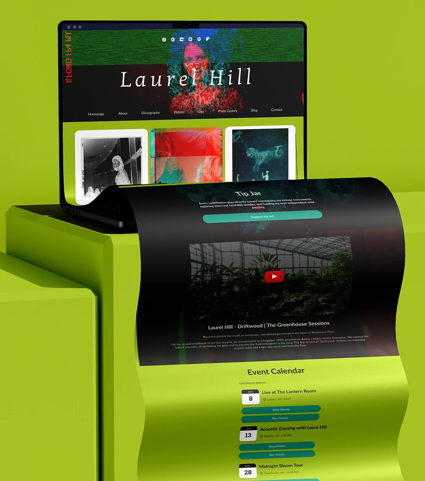
A few sections earn their place on almost any artist homepage:
-
A header with your name and menu, so people can navigate without scrolling back.
-
A featured section for whatever matters right now: a new single, a tour, a pre-order. This is the part you change most often.
-
Latest release, with the music playable on the page.
-
An events or dates section, pulling in your upcoming shows.
-
A text section for a short bio, an announcement, or context for the release.
-
A video section, since a live clip does a lot of convincing that a photo can't.
-
A mailing list signup, which is the one thing on the page that builds something you keep. There's more on making it convert in how to build an email list as a musician.
-
A tip jar, if you want to let fans support you directly.
-
Social links and a contact route in the footer.
You don't need all of them. Start with the header, the music, the featured item, a signup, and contact, then add the rest as you have something to fill them with.
What to leave off
Plenty of what slows a homepage down is stuff that felt like a good idea at the time.
-
Splash pages and intro animations. They delay the music for no benefit and get skipped.
-
Autoplaying video with sound. People browse with the sound off, in public, and it makes them close the tab.
-
Long paragraphs about your journey. A visitor wants to hear you first. Save the story for the about page, and keep the homepage version to a few lines. There's help on writing it in how to write an artist bio.
-
Generic stock photos. A slightly imperfect photo of the actual you works better than a polished picture of a stranger with a guitar.
-
Every social icon you own, scattered across the page. Group them, and put them low.
-
Old content. Last year's tour dates and a two-albums-ago "new release" tell people you've stopped.
Build it for a phone first
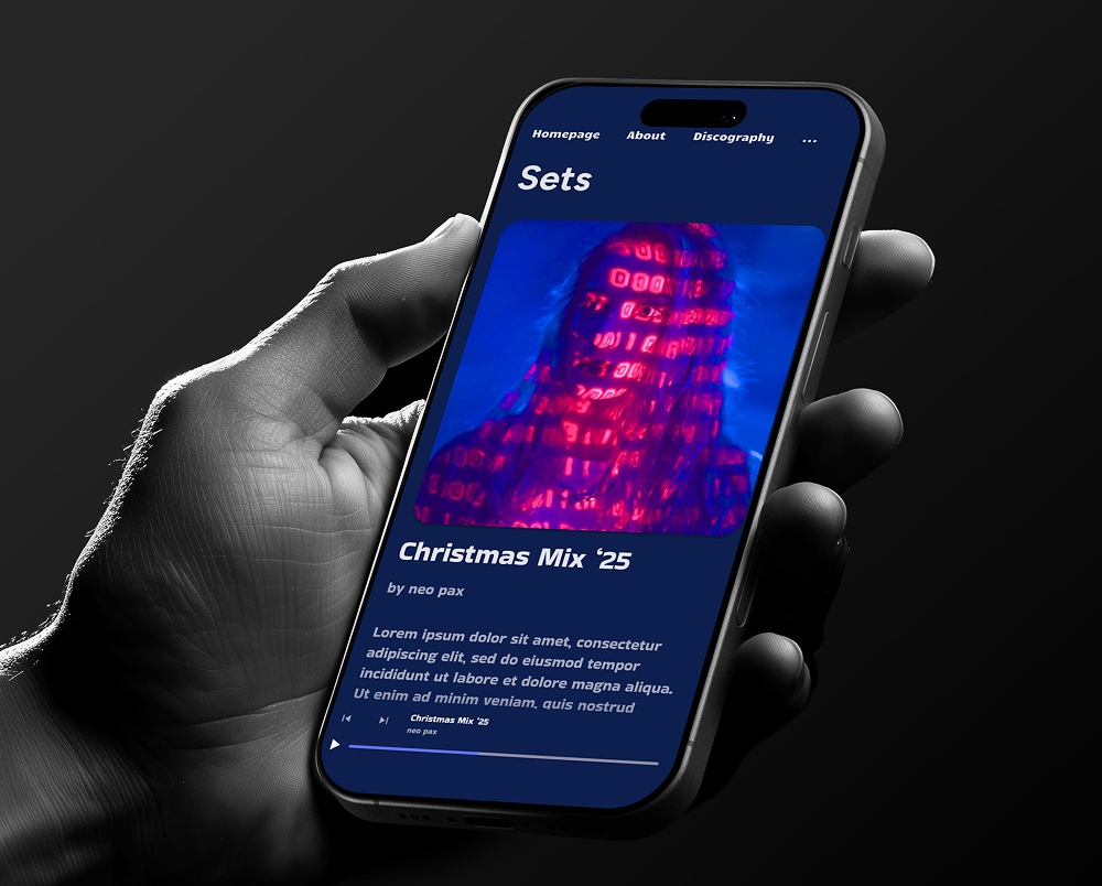
The majority of the people who open your homepage will do it on a phone, often on patchy signal, so that's the version that counts.
Check yours on your own phone and look for the obvious things: does the music player appear without scrolling, is the main button big enough to tap, is the text readable without zooming, and does it load quickly on mobile data. Big background images and heavy video are the usual reasons a homepage crawls on a phone.
Anything that's awkward on a phone is a problem for the majority of your visitors, however good it looks on your laptop. If your builder handles the responsive side and the image sizing for you, this mostly takes care of itself, and you only need to sanity-check the order things appear in.
A homepage layout you can copy
If you want a starting point, this order holds up well:
-
Header: name and menu
-
Hero: strong image, one line on who you are, a play button, one primary button
-
Latest release: player plus links to stream and buy
-
Upcoming shows
-
Store: a few featured items
-
Short about: two or three lines and a photo
-
Video: one live clip
-
Mailing list signup
-
Footer: social links, contact, and your signup again
Build that, then adjust based on what you want people to do. If a section has nothing to fill it, leave it out until it does. Empty sections look worse than a shorter page. For the wider build, there's a step-by-step in how to make a music website.
Build your own musician website
Music player, store, EPK, and mailing list, all built in. Start your 30-day free trial, cancel anytime.
Common mistakes to avoid
-
No music on the first screen. The one thing everyone came for should be a click away, at the top.
-
Five equally loud buttons. Pick one primary action and let the rest be secondary.
-
A homepage that's all image and no information. A beautiful photo with no name, no music, and no next step leaves people with nothing to do.
-
Burying your dates. If you gig, shows belong near the top, since that's what people check.
-
Leaving it stale. A featured section is only useful if it features something current. There's a full audit in common music website mistakes.
-
Designing on a laptop only. Check every change on a phone before you call it done.
Common questions
What should be on a musician's homepage?
Your name and a line about what you do, a way to hear your music in one click, your latest release, upcoming shows if you play live, a mailing list signup, and a contact route. Put the music and one clear action on the first screen, and order everything else by what visitors care about.
What should be above the fold on a music website?
Who you are, a player or listen button, and a single primary action. A strong image is fine as long as it doesn't push the music and the button off the screen. If someone has to scroll to hear you, move things up.
How long should a music homepage be?
Long enough to cover the release, shows, store, a short about, and a signup, which usually comes to a handful of sections. Don't add sections you can't fill, since an empty or stale section does more harm than a shorter page.
Should my homepage or my music page come first?
Your homepage should already play music, so a visitor never needs the music page to hear you. Keep the music page for the full catalog, and let the homepage feature the one release you most want heard right now.
Do I need a photo on my homepage?
One good photo helps people connect a face to the sound, and it sets the tone before a note plays. Use a real photo of you rather than stock imagery, and make sure it doesn't crowd out the music on a phone screen. More on the look and feel in choosing the aesthetic for your musician website.
How often should I update my homepage?
Refresh the featured section with every release, tour, or merch drop, and check your dates monthly. The homepage is the page that dates fastest, since it's the one making a claim about what you're doing right now.
Final thoughts
A good homepage is mostly restraint. Decide the one thing you want a visitor to do, put your name, your music, and that one action on the first screen, and let everything else follow in the order people ask for it.
Then open it on your phone and look at it like a stranger who just heard your name. If you can tell who this is and hear a song within a few seconds, it's doing its job.