Photo by Soragrit Wongsa on Unsplash


Picking how your website looks is the part that stalls people. The music is finished, the photos are back, and then you open a theme picker and lose an afternoon to it.
This guide is for musicians, bands, DJs, and producers who want to settle that decision and move on. It covers how to read your own style, which theme suits which artist, and what to customize afterwards.
Write down three words for your sound before you open a theme picker. They settle the rest of the choices.
Pick the theme from the mood you want a first-time visitor to feel.
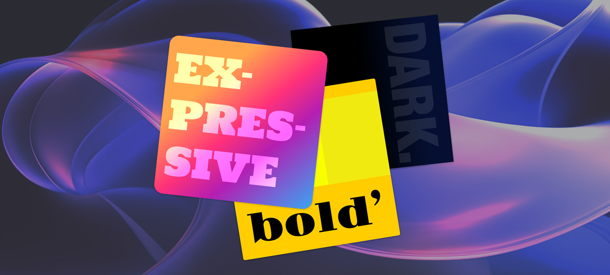
Bold and Expressive suit high-energy and story-driven artists. Chic and Misty suit atmospheric work. Dark suits heavier material. Cozy suits warm, personal writing.
Keep customizing small: two fonts and three colors for the whole site.
Current photos and a featured release carry more of the look than the styling does.
Start with three words that describe your sound, then pick the theme whose mood matches those words. Adjust its colors and fonts afterwards, keeping to two fonts and three colors. Fill the pages with current photos and a featured release, then stop. The content carries more of the look than the styling does.
Write down three words for the feeling you want a first-time visitor to have. Warm and acoustic. Cold and mechanical. Loud and scrappy. Those three words settle the later decisions for you.
Two things make it easier:
Pull ten images you'd want your music to sit next to. Album covers, film stills, photos of rooms. Ten is enough to see a pattern you could not have described in words.
Look at what you already have. Your press photos, last cover art, and social colors are the raw material. A site that clashes with them looks unfinished.
If your visual identity is still unsettled, work that out first. There's a full walkthrough in How to Brand Yourself as a Musician, and the decisions there feed straight into this one.
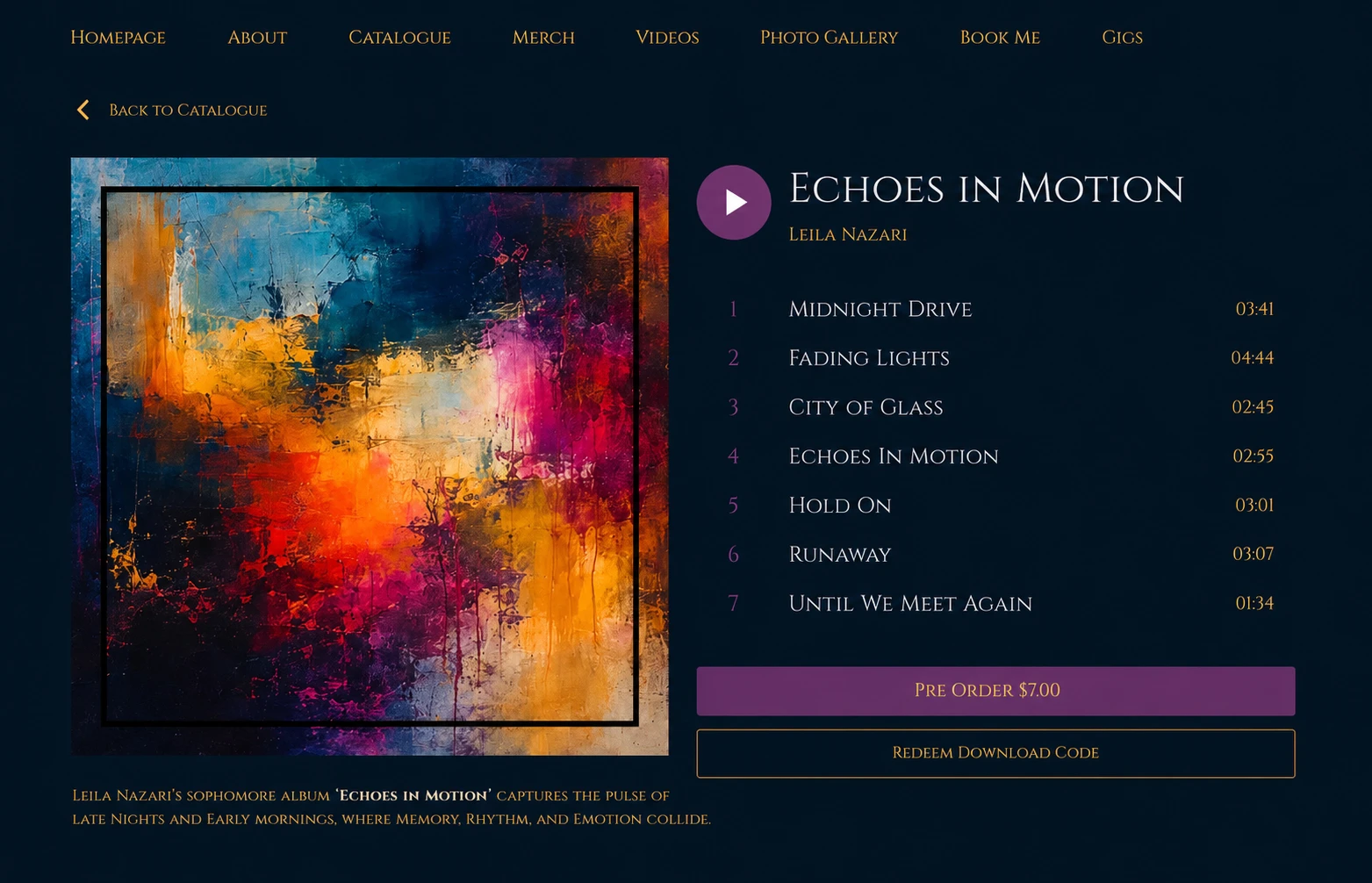
Every website template comes with six themes: Bold, Expressive, Misty, Chic, Dark, and Cozy. Each sets a starting point for colors, fonts, and corner shapes, all of which you can change afterwards.
The kind of artist each one tends to suit:
Bold. High-contrast and loud, built for punchy artwork. Suits punk, rap, and dance acts with strong cover art.
Expressive. More room for images and long text, so it holds a story well. Suits songwriters and concept records.
Misty. Soft edges and muted color. Suits ambient, dream pop, and anything atmospheric.
Chic. Clean and restrained. Suits jazz, classical, session players, and anyone whose site doubles as a professional profile.
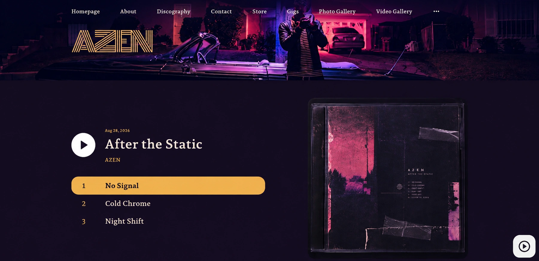
Dark. A dark background throughout, which makes photos and video sit forward. Suits metal, techno, and darker electronic work.
Cozy. Warm colors and rounded shapes. Suits folk, acoustic, and anything personal.
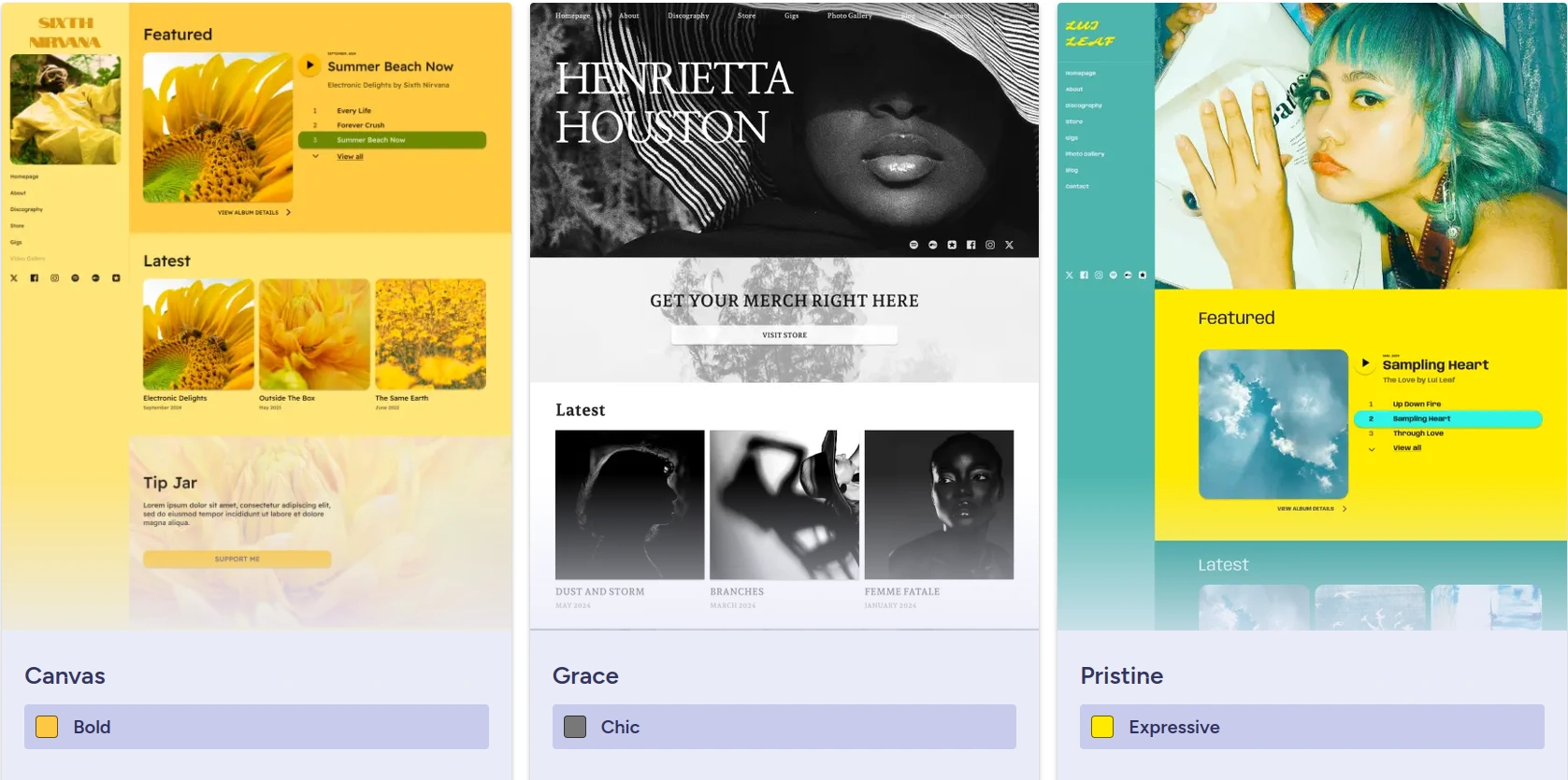
Two of them will usually fit your three words. Open both on your phone before deciding, since that is where the first visit tends to happen. You can see all six running on real layouts in the musician website examples.
Changing your mind later costs nothing, because the theme sets styling only and your pages stay where they are.
The photos you put in carry most of the impression. A striking layout filled with low-resolution phone shots from three years ago reads as neglected, whatever the theme.
So before another hour on styling:
Put one current, high-resolution press photo at the top.
Feature the release you want people to hear first.
Cut any gallery image you would not send to a promoter.

There's a section-by-section breakdown of what belongs up there in What to Put on Your Music Website Homepage.
The page types come pre-designed, so your job is filling them in. About for your story, Discography for releases, Gallery for photos and video.
Add only the pages you can keep current. An empty Gallery or a Gigs page showing last year's dates is worse than no page, and both can stay hidden until you have something for them. The full list is in the help article on the page types you can add.
Once the theme is set, the details are yours. You can change:
Background color, which does more to change the feel than anything else on this list
Primary and secondary colors, used for buttons and highlights
Text and title colors
App bar and footer colors
Fonts, with 264 families to choose from, set separately for titles and body text
Keep it tight. Two fonts and three colors is enough for a whole site, and going past that is the usual way a good theme starts looking messy. One font for headings, one for body text, then leave them alone.
You can also set a photo as a page or section background. Behind a short section it looks good. Behind long text it makes the words hard to read.
To build a palette you can reuse on artwork and socials too, see the color section of How to Brand Yourself as a Musician.
A few elements change what the page does:
A Featured section puts one release at the top with its artwork, so a visitor hears the thing you want heard.
A Tip Jar lets people pay you directly from the page.
A signup form collects emails from visitors who came for one song and might stay for the next.
There's more on how these fit together in 10 Ways Your Musician Website Can Help You Promote, Sell, and Connect.
Trust your three words over any trend. A restrained site for restrained music is right even when a louder theme previews better, because visitors arrive expecting what your music promised them.
Give yourself a deadline. An afternoon covers a first pass, and you'll make better calls once people have seen it. Several styling decisions that look fine in the editor cause problems on a phone, and those are covered in 10 Common Music Website Mistakes.
How do I pick a theme if my music covers several styles?
Choose for the release you are pushing now, not for your whole catalogue. The theme takes a minute to change, so you can move it when your next record has a different mood. A neutral option like Chic or Expressive handles a mixed catalogue better than a strongly flavoured one.
Should my website match my album artwork?
It helps if they share a palette and a general mood, because someone arriving from a streaming link recognises they are in the right place. Matching exactly is not necessary, and it dates the site as soon as the next record comes out.
Can I change the theme after my site is live?
Yes, and nothing else moves. The theme controls styling only, so your pages, text, images, and store stay as they are.
Is it worth paying a designer instead?
Only for something a theme cannot cover, like a custom illustrated layout. To present your music, photos, and dates, a theme plus your own photos gets you there. There's a breakdown in What a Band Website Designer Costs.
Build your own musician website
Music player, store, EPK, and mailing list, all built in. Start your 30-day free trial, cancel anytime.
Choosing your look comes down to three words about your sound, the theme that matches them, and a small set of colors and fonts you stick with. Current photos and a release worth pressing play on do the rest.
Give it an afternoon, publish, and adjust when the next press photos come in.
Get our new guides by email.
Practical advice on promoting your music, getting gigs and selling online. You can unsubscribe at any time.
Marketing & Promotion
How to Promote Your Music Without a Label (10 Ways)