Photo by Rafael Sales on Unsplash


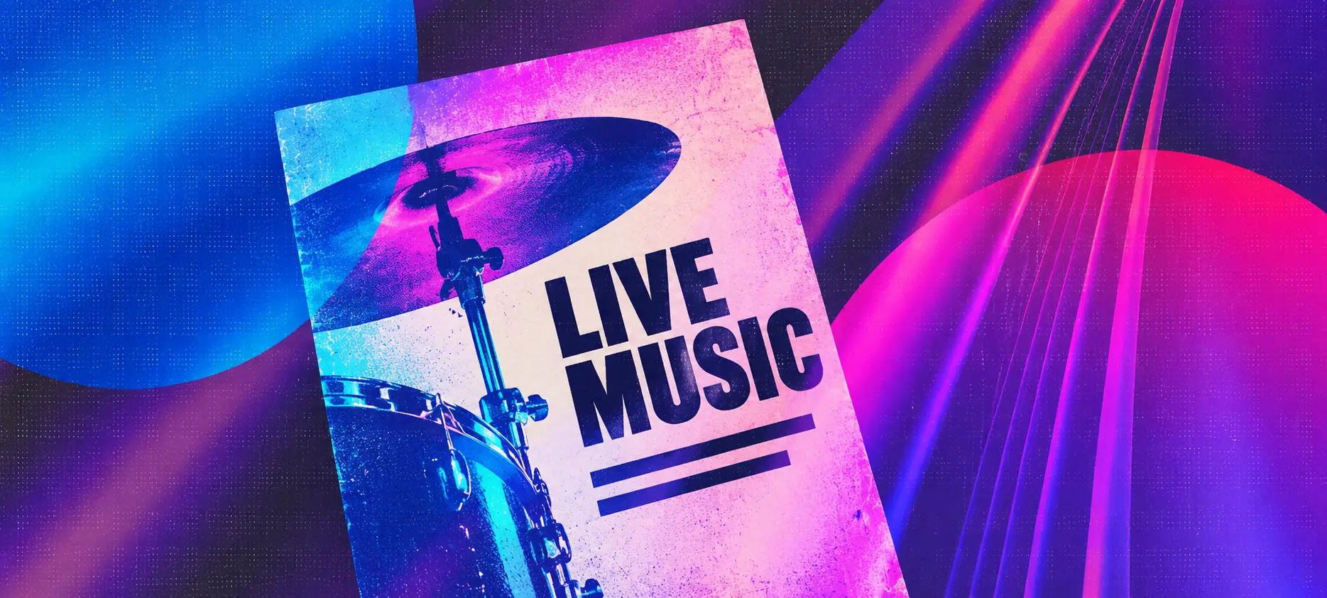
Your show is confirmed, and the venue has asked for a poster. You have a photo you like, three acts to fit on the bill and a ticket link that runs across half the page. Once you start moving things around, the date ends up smaller than the photographer's credit.
This guide walks through making a gig poster for a local show, from gathering the details to checking the finished design. There's a fictional example below, with the poster text and an explanation of where each part goes. You can use the same process for a concert flyer or a show announcement on social media.
Confirm the billing order, date, venue, times, age restriction and ticket information with the organiser.
Give the act names, date and venue enough space to read at a glance.
Keep the text and artwork separate in your working file so you can rearrange them for different sizes.
Put a readable ticket or show-page address on printed copies, even if you also use a QR code.
Check the poster on a phone and at its intended print size before approving it.
A gig poster should include the performing acts, date, venue and city, doors or start time, ticket information and any age restriction. Use the agreed billing order and label times clearly. Give readers a usable address for tickets or show details, then check every fact with the organiser before sharing it.
Collect those details in one note before opening your design app. Include the exact venue name and address, the approved ticket prices and any required promoter or sponsor credit. A venue with several rooms may need the room name too.
Confirm who is making the official poster. If the promoter already has artwork, ask for the versions you need. If you're making it, agree who approves the final design and when everyone will announce the show. This avoids two posters circulating with different lineups or times.
Here's the text for an illustrative three-act show. The acts, venue, address and ticket prices are fictional, and the .example address is a demonstration address. Morrow Arcade is the headliner; Afterglass and June Circuit are the support acts in their agreed billing order.
MORROW ARCADE
With Afterglass + June Circuit
FRIDAY 16 OCTOBER 2026
The Lantern Room, Leeds
24 Example Street
Doors 7pm / Music 7:30pm
Ages 18+
£10 advance, including fees
£12 on the door
Door tickets subject to availability
Tickets & show details:
morrowarcade.example/shows
For a first layout, use a portrait page with dark text on a pale background. Put Morrow Arcade at the top in the largest type, with the two support acts together beneath it. Place a band photo in the middle. Keep a clear area below the photo for the date, venue, times and ticket information.
Make the date and venue the next things you notice after the headliner. Keep the street address close to the venue name, and put both times on one line so nobody has to search for what “7pm” means. The ticket details form a separate group at the bottom.
The headline identifies whose show it is, and the support line preserves the agreed bill. The date and venue let someone decide whether they can attend, while the bottom group tells them how to get a ticket.
This layout can change with the event. For a co-headline show, agree equal prominence for both names. For a recurring club night, the event name might lead. Billing comes from the agreement with the organiser, including relative name sizes, required logos and credits.
Use a graphics editor that lets you move text boxes and images separately. Set the page to the intended size before arranging it. A blank page or an existing poster layout can both give you a starting point; remove sample text and check that your longest act name fits.
Start with the example's four groups: acts, artwork, date and venue, then attendance details. Leave a visible gap between groups and keep related lines closer together. Align the practical details to a shared left edge so readers can follow them down the page.
If the bottom gets crowded, reduce the photo's height and move the date and venue up. You can also remove a decorative border or a repeated event slogan. Keep the ticket details readable as you make room.
Leave space inside the edges of the page. Text placed against the border can look cramped, and physical trimming or a platform's preview crop may remove it.
Try the band's existing name treatment first. Use straightforward lettering for addresses, times and prices, especially if the logo is heavily stylised. If someone unfamiliar with the band can't read the logo, include the name in plain text as well.
Keep small text on an even background. In the example, the show details sit on the pale page below the photograph. Putting them over a drummer's cymbals would introduce bright edges behind the letters and make the lines harder to follow.
Shrink the preview to roughly the size someone will see on their phone. Read the date, venue, age restriction and ticket line without zooming in. If you struggle, enlarge that text or give it more space.
Use the colours and artwork you already associate with the band. If those choices are still unsettled, how to brand yourself as a musician covers developing that wider visual identity.
A band photo can fill the middle of this layout, but check the whole group before committing to it. A tight portrait crop might cut out the musician standing at the edge. Try a wider image area or use another shot from the same session.

Use the original image file supplied by the photographer or artist, and agree any cropping and credit requirements. Enlarging a small screenshot from a social post can leave visible blur in print. A suitable photo from your EPK's press-photo selection may already be available.
Illustration, a collage or lettering can also provide the main artwork. Keep the practical text on separate layers so a date change doesn't require rebuilding the image.
Save a copy of the editable design for each placement. Ask the venue which print sizes and digital shapes it needs, and check the current requirements of the platforms you'll use.
For the example, a square version needs a different balance. Make the photo shallower, keep the acts above it and move the date and venue closer together below it. Preserve the ticket and age information. Cropping a finished portrait image into a square could remove that entire bottom group.
| Placement | Layout adjustment | Final check |
|---|---|---|
| Printed poster | Allow space inside the trim | Read it at viewing distance |
| Feed image | Rearrange text groups | Check the small preview |
| Story image | Allow for buttons and overlays | Preview it in the app |
| Event listing | Match the requested image shape | Inspect the listing's crop |
Check each exported version, including any thumbnail the destination creates. A full image and its preview may display differently. Move the act names and date if a preview cuts them off.
Repeat the date, venue and ticket information in the post or listing text. Someone should still be able to read those details when an image doesn't load or they use a screen reader. In an email, include a normal text link to tickets as well as the artwork. The show announcement in these band newsletter examples shows how to write the accompanying message.
On a printed gig flyer, use a short, readable address that opens the correct ticket listing or show details. Type the exact printed address into a phone browser to test it. If you use a short link, check that it will remain active through the event.
A QR code can sit beside that address, labelled “Tickets” or “Show details.” Keep its surrounding blank margin intact. DENSO WAVE specifies a clear margin around a QR code measuring four of its small squares on every side. Keep artwork and lettering outside that margin.
Scan the code from a copy printed at the final size, at a distance someone could reasonably stand from the poster. Check that it opens the right show and that the ticket button is easy to find.
For digital placements, provide a clickable link wherever the platform supports one. People viewing the poster on their phone should have a way to open the destination directly.
Ask the printer for the finished size and file requirements before exporting. These can include image resolution, colour settings, bleed and whether crop marks are wanted. Follow the requirements for that print job.
Bleed is extra artwork extending beyond the final cut edge. It allows for small variations in trimming, which can otherwise leave a white strip at the edge of a coloured background. Adobe's guide to print bleed explains the distinction and advises checking the required amount with your printer.
Extend edge-to-edge backgrounds into the requested bleed, while keeping names, dates and ticket details safely inside the finished page. If you're using a home or office printer, check its printable area; you may need a white border.

Print a proof at the intended size before ordering a batch. Check the small lettering and look for faces or artwork that have become too dark. For a colour-sensitive design, ask the printer about a proof on the paper you'll use. A home print can help you check size and spelling, but its colours may differ from the final run.
Send the organiser the exported poster for approval. Include the digital versions too, since rearranging a layout can introduce a missing line or an old date.
Read it against the confirmed show details:
Are all act names spelled correctly, with the agreed billing and credits?
Does the weekday match the date, and is the year correct?
Are the venue, city and any room or address details accurate?
Are doors and music start times labelled correctly?
Do the prices match the ticket listing, including how fees are described?
Is the age restriction correct, and does the ticket link or QR code open the right event?
Ask someone who hasn't been editing it to read it too. Have them tell you when and where the show is and how they'd buy a ticket. Their hesitation may reveal a detail you've stopped noticing after an hour of revisions.
Keep one clearly named approved version for everyone to share. If the venue or date changes later, replace the digital artwork, correct the event listings and tell the people displaying printed copies. For the wider announcement and reminder schedule, use the promotion section of how to get gigs as a musician.
The destination on your poster can be the organiser's ticket page. If you use your band's website, make the advertised show easy to find, with its date, venue and ticket button together. A visitor who wants to hear the band before booking can then play a track on the same site.
On Noiseyard, the Gigs page supports event details and an external ticket link, with an optional image in the standard display. Add the poster there and repeat the practical information in the listing's text. For a run of dates, keeping your website current during a tour covers the ongoing updates.
You can also offer a mailing-list signup for someone who likes the band but can't make this date. Say what they'll receive, such as news of upcoming shows. The musician email-list guide covers setting that up; keep access to this show's details and tickets straightforward.
Build your own musician website
Music player, store, EPK, and mailing list, all built in. Start your 30-day free trial, cancel anytime.
What size should a gig poster be?
Use the size the venue or display space accepts. A4 or US Letter can suit a noticeboard; a larger wall space may need a larger format. Confirm the finished dimensions with whoever will print or display it, then check readability at the expected viewing distance.
Does a gig poster need a band photo?
No. You can use an illustration, a collage or a design built around lettering. A photo is useful when it suits the show and fits the space available. The acts, date, venue and attendance details still need to be readable around whichever artwork you choose.
Should I include doors and start times?
Include both when the organiser has confirmed them, and label them separately. “Doors 7pm / Music 7:30pm” tells people when they can enter and when the first performance begins. Check what any time you've been given refers to before putting it on the poster.
Can I use the same poster for print and social media?
You can reuse the artwork and wording. Keep an editable original, then make versions for the required shapes and export settings. Check every version after resizing, particularly the date and ticket details near the edges, before sending it to the venue or posting it.
Useful tips and tricks, delivered right to your inbox.
Join our newsletter to keep informed about Noiseyard updates and new blog articles. You can unsubscribe any time.