Photo by Елизавета Крылова on Unsplash


Branding sounds like something a company does. For a musician it's simpler than that: it's whether the way you look matches the way you sound, and whether someone who sees you in three different places recognizes you as the same artist.
This post is for musicians, bands, and DJs whose visuals have grown by accident: a different photo on every platform, cover art that doesn't match the music, a logo made in a hurry. It covers how to work out your look from the music itself, the four pieces you need, where your look lives, and how to keep it consistent without starting over every year.
Your branding is whether your look matches your sound. Get that right and everything else follows.
Start from the music. Write down a few words that describe how it feels, then choose visuals that fit those words.
You need four things: photos, cover art, a color and type choice, and a consistent treatment of your name.
Your website is where you control the whole look. Everywhere else you're inside somebody else's template.
Consistency does more for you than polish. The same photo, colors, and name treatment everywhere is what makes you recognizable.
Change it when the music changes, and leave it alone the rest of the time.
It's the visual and verbal shorthand people use to recognize you: your photos, your cover art, your colors and type, how you write about yourself, and how consistently those appear. Good branding tells someone what you sound like before they press play, and makes you recognizable across your website, your releases, and your socials.
The common mistake is starting from a mood board of other artists you admire, which is how you end up looking like a slightly worse version of them.
Start from your own music instead. Play the tracks you're proudest of and write down three to five words that describe how they feel: warm, cold, cheap, lush, nocturnal, hopeful, blunt, playful. Be specific. "Cool" tells you nothing, whereas "cold, mechanical, late-night" already suggests colors, photo styles, and typefaces.
Then make every visual decision against those words. If your music is warm and acoustic, cold blue tones and hard geometric type are working against you. When the look and the sound disagree, the look loses, because people trust their ears and feel confused by the mismatch.
If you're stuck, ask a few listeners to describe your music in three words without prompting them. Their answers are often more useful than your own.
Get our new guides by email
You don't need a brand manual. Four things cover it.
Photos. The most-used asset you own. You need a handful you like: one clear shot of your face or the band, one wider or more atmospheric image, and one you can crop square. They'll end up on your site, your socials, your press coverage, and posters.
Cover art. Each release needs its own artwork, and a family resemblance across them helps people see your catalog as a body of work. Consistent framing, palette, or type treatment is enough.
Colors and type. Two or three colors and one or two typefaces, used the same way everywhere. This is the cheapest way to look coherent.
Your name treatment. How your name appears: the typeface, the capitalization, the spacing. A full logo is optional, and a consistent way of setting your name in type does most of the same work.
That's the whole kit. Consistency across these four does more for how professional you look than any single expensive asset.

Everywhere else you appear, you're a guest. Instagram gives you a square and a circle. Spotify gives you a banner and an avatar in a layout it controls. A link list puts you in the same template as everyone else, in their colors, with their branding at the bottom.
Your own website is the one place where the whole look is yours: the colors, the fonts, the images, the layout, the order things appear in, right down to the icon in the browser tab. On a builder made for musicians you pick a template, set your colors and type, and the whole site follows, so the identity you worked out carries across the whole site rather than being squeezed into someone else's frame.
It's also the version people see when it matters. A booker, a journalist, or a label checking you out ends up on your site, and that page does the job a magazine spread would have done twenty years ago. There's a walkthrough of arranging the front page in what to put on your music website homepage, and if you're choosing between looks, how to choose the aesthetic for your musician website covers picking a template and theme that suits you.
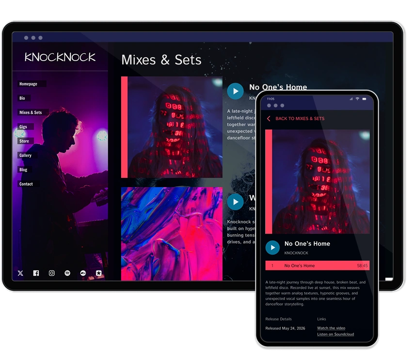
Build your own musician website
Music player, store, EPK, and mailing list, all built in. Start your 30-day free trial, cancel anytime.
Once your look is settled, the job is repetition. Someone should see your Instagram, your Spotify profile, and your website and know it's the same artist without checking the name.
Use the same photo as your profile image everywhere, for at least a release cycle.
Crop from the same set. Keep a folder of your photos already cropped square, wide, and vertical, so you're not hunting for something usable at midnight.
Match your artwork to your posts. Pull the colors from your current cover art into the graphics you make for that release.
Keep your name written one way. Same capitalization and spelling everywhere, which also helps people find you in search.
Carry it onto merch. Your shirts and prints are your look in public, so keep them in the same family. There's more on producing them without upfront cost in print-on-demand merch for musicians.
Write in one voice too. Visual identity is half of it, and the way you write about yourself carries the rest. How to write an artist bio covers getting that consistent, and what to post as a musician has ideas that fit a settled identity.
Branding gets expensive quickly if you let it, so spend in order of what gets used most.
Worth paying for:
Photos. The single best use of a small budget. A short session with someone competent gives you images you'll use for a year or more, and press will use them too. Nothing else you buy gets this much mileage. The EPK guide covers what press needs from your photo set.
Cover art, if you can't make something you're happy with. It's the first thing anyone sees on every platform.
Fine to do yourself:
Color and type choices. Pick two or three colors and one or two typefaces. Restraint reads as intent.
Social graphics, once your palette and type are settled.
A name treatment. Setting your name in a typeface you like, consistently, gets you most of the way to a logo.
Can wait: a custom logo, a full brand guide, and anything else that doesn't change what a visitor sees in the first five seconds.

Consistency only pays off if you give it time, so resist redesigning every few months out of boredom. People need repetition before they recognize anything.
Reasons to change:
The music changed. A new direction that your old visuals contradict is the clearest reason to update.
A new era or album. Refreshing the palette and photos for a record is normal, while keeping enough continuity that people still recognize you.
It was never right. If your visuals were rushed and always felt wrong, fix them once and properly.
Reasons to leave it alone: you're bored of it, or you saw another artist's look you liked. You'll be sick of your own branding long before your audience notices it, which is usually a sign it's working.
When you do change, change everything within a week or two. Half-updated visuals across five platforms look like neglect.

Copying an artist you admire. You end up looking derivative and confusing people who know the original.
A different photo on every platform. Nobody connects them, so you get none of the benefit of repetition.
A look that fights the music. Harsh, dark visuals on gentle acoustic songs sets up an expectation you don't meet.
Too many colors and fonts. Two or three colors and one or two typefaces read as deliberate. Six of each reads as an accident.
Cover art that's unreadable small. People see it as a thumbnail far more often than full size, so check it small before you commit.
Redesigning constantly. Recognition needs repetition. Give a look at least a full release cycle.
Start from your music: write down three to five words describing how it feels, then choose photos, cover art, colors, and type that match those words. Use them consistently across your website, releases, and socials, so anyone who sees you twice recognizes you.
Not to begin with. A consistent treatment of your name, meaning the same typeface, capitalization, and spacing everywhere, does most of what a logo does. Spend on photos and cover art first, and add a logo later if you want one for merch and stamps.
Two or three, plus a neutral. That's enough to look deliberate and few enough to stay consistent across a website, artwork, and social graphics. Pick them to match the feeling of your music rather than what's fashionable.
Photos first, since they get used everywhere and last a year or more, then cover art if you can't make something you're pleased with. Color and type choices, social graphics, and a name treatment you can handle yourself. A custom logo and a brand guide can wait.
Give any look at least a full release cycle, and refresh it around a new album or a genuine change in direction. You'll tire of your own branding long before your audience registers it, so boredom on its own is a poor reason to start over.
On your own website, since it's the only place you control the whole look, and it's where bookers, press, and labels go when they check you out. Everywhere else you're fitting your identity into a layout somebody else designed.
Branding for a musician comes down to two questions: does this look like it sounds, and would someone recognize me from it twice. Answer both and you're ahead of a lot of artists with bigger budgets.
Write down the words that describe your music, choose four things that fit them, put them everywhere, and then leave them alone long enough for people to learn them. That's most of it.
Get our new guides by email.
Practical advice on promoting your music, getting gigs and selling online. You can unsubscribe at any time.